
Zomato Data Analysis Using Python with Source Code
Zomato Data Analysis Using Python with Source Code – Exploratory Data Analysis (EDA) and Data Visualization with Python
Introduction:
Zomato’s restaurant dataset provides valuable insights into food trends, restaurant types, and customer preferences. This project focuses on performing Zomato Data Analysis Using Python with Source Code. It covers exploratory data analysis (EDA), data cleaning, and visualization to uncover patterns and derive insights from the dataset. This guide is perfect for beginners looking to enhance their data science skills.

Objective:
- Perform exploratory data analysis (EDA) on the Zomato restaurant dataset.
- Clean and preprocess the data for better visualization and interpretation.
- Identify key trends and insights related to restaurant ratings, cuisines, and pricing.
- Provide source code to enable easy replication of the project.
Dataset:
The Zomato dataset can be found on Kaggle. Download the ‘zomato.csv’ file for analysis.
Tools & Libraries:
- Python
- Pandas
- NumPy
- Matplotlib
- Seaborn
- Jupyter Notebook or Google Colab (Recommended)
Instructions:
- Use Jupyter Notebook or Google Colab for seamless execution.
- Copy the provided code into cells and run each section step by step.
- Detailed explanations are provided to help users learn from the project.
- This project is structured to maximize understanding for beginners while providing source code for easy implementation.
Lets Start Zomato Data Analysis Using Python with Source Code
Implementation Steps:
1. Data Collection & Setup
In this step, we import essential libraries and load the dataset.
import pandas as pd # Data manipulation and analysis
import numpy as np # Numerical computing
import matplotlib.pyplot as plt # Visualization
import seaborn as sns # Advanced visualization
%matplotlib inline # Show plots directly in the notebook
# Load the dataset
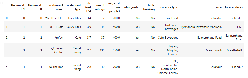
data = pd.read_csv('/path/to/zomato.csv') # Replace with actual file path
data.head() # Display the first 5 rows Output:
- Explanation:
pandasandnumpyare crucial for data manipulation.- Visualization is powered by
matplotlibandseaborn. - We load the dataset and take an initial look at its structure using
head().
2. Data Exploration
We will now explore the dataset to get an overview of its structure.
data.info()  # Overview of dataset, data types, and missing values
data.describe()  # Statistical summary
data.columns  # List of columns
Output:
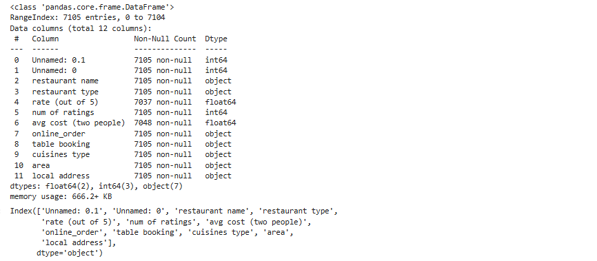
- Explanation:
info()shows the number of non-null entries and data types.describe()provides statistical measures of numerical columns.columnslists the dataset’s features for a better understanding.
3. Data Cleaning
Handle missing values and remove duplicates for a cleaner dataset.
# Check for missing values
data.isnull().sum()

# Drop unnecessary columns
data.drop(['url', 'phone', 'address'], axis=1, inplace=True)

# Handle missing values in 'rate' and 'location' columns
data['rate'].fillna(data['rate'].mode()[0], inplace=True)
data['location'].fillna('Unknown', inplace=True)

# Remove duplicates
data.drop_duplicates(inplace=True) - Explanation:
- Missing values in critical columns like
rateare filled with the most frequent value (mode). - Irrelevant columns are removed to simplify the analysis.
- Duplicates are removed to ensure data integrity.
- Missing values in critical columns like
4. Visualization & Insights
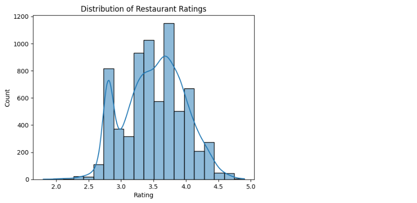
Distribution of Ratings
Let’s visualize the distribution of restaurant ratings.
sns.histplot(data['rate'], bins=20, kde=True)
plt.title('Distribution of Restaurant Ratings')
plt.xlabel('Rating')
plt.ylabel('Count')
Output:
- Explanation:
- A histogram with KDE (Kernel Density Estimate) shows the spread of ratings.
- This helps identify popular rating brackets.
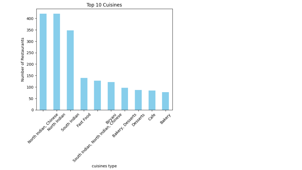
Top 10 Cuisines
Visualize the most common cuisines.
top_cuisines = data['cuisines'].value_counts().head(10)
top_cuisines.plot(kind='bar', color='skyblue')
plt.title('Top 10 Cuisines')
plt.ylabel('Number of Restaurants')
plt.xticks(rotation=45)
Output:
- Explanation:
- The most popular cuisines are highlighted using a bar chart.
- This can show regional food trends.
Restaurant Types
Analyze the types of restaurants available.
sns.countplot(y='rest_type', data=data, order=data['rest_type'].value_counts().index[:10])
plt.title('Top 10 Restaurant Types')
plt.xlabel('Count')
plt.ylabel('Restaurant Type')
Output:
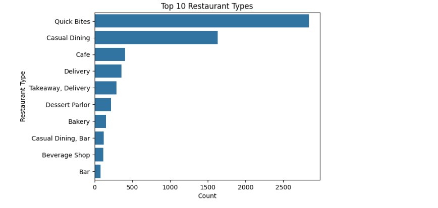
- Explanation:
- This visualization shows the variety of restaurant types, helping identify dominant categories.
5. Correlation Heatmap
Identify relationships between numerical features.
plt.figure(figsize=(10,6))
sns.heatmap(data.corr(), annot=True, cmap='coolwarm')
plt.title('Correlation Heatmap')
Output:
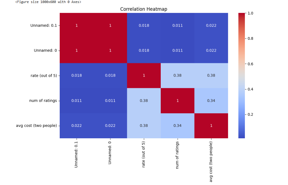
- Explanation:
- The heatmap highlights correlations, revealing which features strongly interact.
6. Conclusion
This project on Zomato Data Analysis Using Python with Source Code offers valuable insights into customer preferences, popular cuisines, and restaurant types. By cleaning and visualizing the data, we derived meaningful insights that can guide business decisions and enhance user experiences.
Download the dataset and try expanding the visualizations! You can further analyze restaurant chains or compare cities to deepen your understanding. By following this project, you’ll gain essential data science skills while working with real-world data.
CLICK HERE TO READ MORE ABOUT SUCH PROJECTS
Keywords: Zomato Data Analysis Using Python with Source Code, Zomato EDA, Python Data Science Project.
CLICK HERE TO DOWNLOAD THE ipynb file of this Project.