Data Visualization Techniques: A Comprehensive Guide
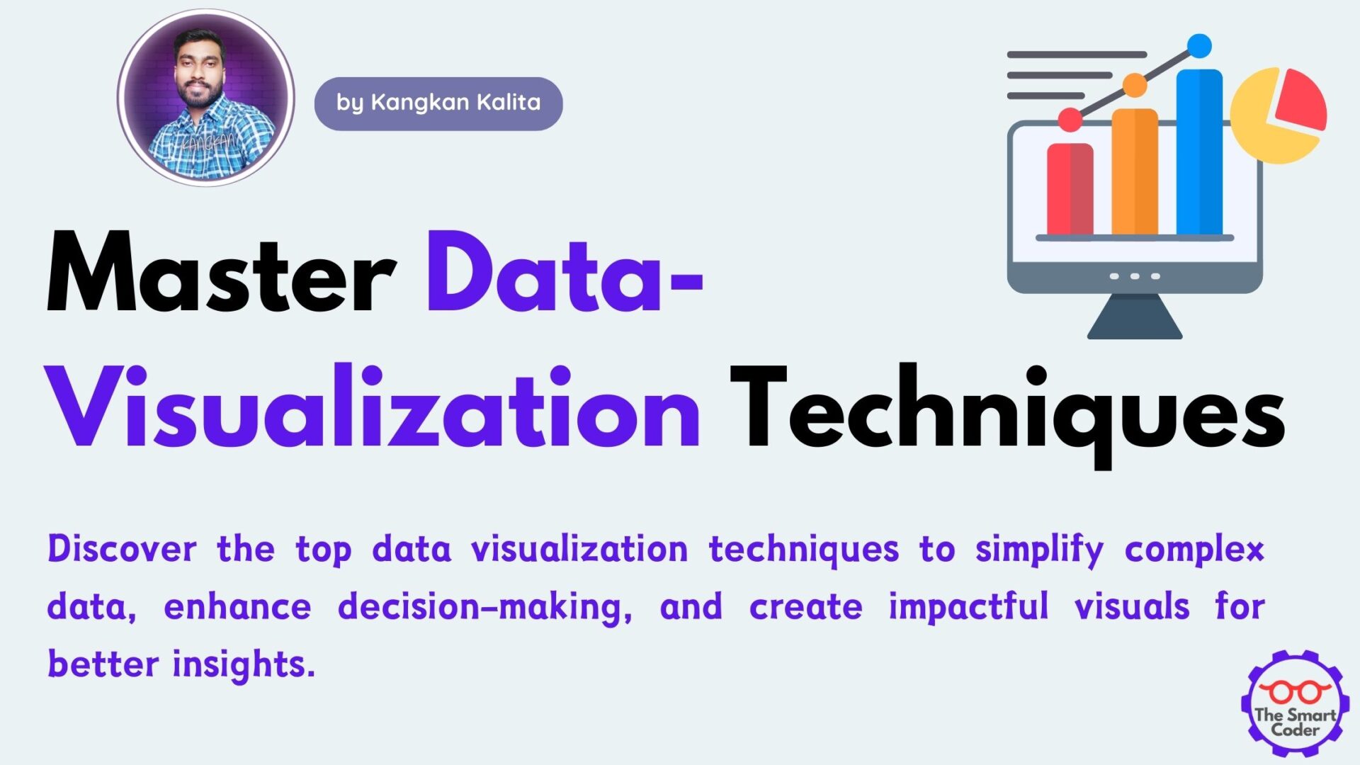
In today’s data-driven world, understanding and interpreting vast amounts of information is crucial. Data visualization techniques play a key role in simplifying complex data and presenting it in a meaningful way. Whether for business intelligence, scientific research, or personal insights, leveraging the right data visualization techniques can enhance decision-making and communication.
This guide explores the most effective data visualization techniques, their applications, and how to choose the right method for different types of data.
What is Data Visualization?
Data visualization is the process of representing data graphically to identify patterns, trends, and insights. By transforming raw data into visual formats like charts, graphs, and maps, organizations and individuals can make informed decisions efficiently.
Importance of Data Visualization Techniques
Effective data visualization techniques provide several benefits, including:
- Enhanced comprehension: Visual data is easier to understand than raw numbers.
- Faster decision-making: Quick insights lead to informed decisions.
- Identifying trends and outliers: Patterns that may go unnoticed in tables become clear.
- Improved storytelling: Visuals make data-driven stories more compelling.
- Better communication: Stakeholders can grasp complex information effortlessly.
Top Data Visualization Techniques
1. Bar Charts
Bar charts are among the most commonly used data visualization techniques for comparing categorical data. They are ideal for:
- Showing frequency distributions
- Comparing different categories
- Visualizing survey results
Best Practices:
- Use consistent colors for categories.
- Keep labels clear and concise.
- Avoid excessive bars that clutter the visualization.
2. Line Graphs
Line graphs effectively display trends over time, making them useful for:
- Financial analysis
- Sales performance tracking
- Scientific research
Best Practices:
- Use clear axis labels.
- Avoid unnecessary gridlines.
- Highlight key trends with annotations.
3. Pie Charts
Pie charts are best for showing proportions in a dataset. They are commonly used in:
- Market share analysis
- Budget allocation
- Demographic distribution
Best Practices:
- Limit the number of slices (ideally five or fewer).
- Use contrasting colors for better visibility.
- Label percentages directly on the chart.
4. Scatter Plots
Scatter plots help visualize relationships between two variables. They are useful for:
- Identifying correlations
- Spotting outliers
- Predictive analysis
Best Practices:
- Use trend lines to indicate patterns.
- Avoid clutter by limiting data points.
- Clearly label axes and data categories.
5. Heatmaps
Heatmaps use color coding to represent data intensity. They are commonly used in:
- Website analytics (user engagement heatmaps)
- Geographic data representation
- Correlation matrices in data science
Best Practices:
- Use a consistent color gradient.
- Provide a clear legend.
- Avoid excessive detail that makes interpretation difficult.
6. Histograms
Histograms visualize the distribution of a dataset by grouping data into bins. They are useful for:
- Analyzing frequency distributions
- Understanding variations in data
- Identifying normality or skewness in distributions
Best Practices:
- Use appropriate bin sizes.
- Label axes clearly.
- Avoid gaps between bars.
7. Bubble Charts
Bubble charts add a third dimension to scatter plots, where the size of the bubble represents an additional variable. They are ideal for:
- Comparing multiple data dimensions
- Market research analysis
- Financial projections
Best Practices:
- Use varying sizes effectively.
- Avoid overlapping bubbles.
- Maintain clarity with proper spacing.
8. Tree Maps
Tree maps are useful for displaying hierarchical data using nested rectangles. They are used for:
- Visualizing budget distributions
- Organizing website structures
- Representing stock market performance
Best Practices:
- Use proportional sizing for better representation.
- Apply contrasting colors.
- Keep labels legible.
9. Sankey Diagrams
Sankey diagrams show the flow of data between categories, making them ideal for:
- Energy consumption analysis
- Website traffic flow
- Financial transactions
Best Practices:
- Maintain clear directional flow.
- Avoid excessive category splits.
- Use color differentiation for better clarity.
10. Choropleth Maps
Choropleth maps display geographic data by shading regions based on a variable. They are commonly used for:
- Population density analysis
- Election results visualization
- COVID-19 spread analysis
Best Practices:
- Use a meaningful color scale.
- Provide a clear legend.
- Avoid using too many shades that confuse interpretation.
Choosing the Right Data Visualization Technique
Selecting the best data visualization technique depends on the type of data and the objective. Consider the following factors:
- Type of data: Categorical, numerical, hierarchical, or geographical
- Purpose of visualization: Comparison, trend analysis, distribution, or relationship mapping
- Audience understanding: Tailor the complexity based on your audience’s familiarity with data visuals
Tools for Implementing Data Visualization Techniques
Several tools can help create powerful data visualization techniques, including:
- Tableau: Advanced analytics and interactive dashboards
- Microsoft Power BI: Business intelligence visualizations
- Google Data Studio: Free tool for creating dynamic reports
- Python (Matplotlib, Seaborn): Customizable coding-based visualizations
- D3.js: JavaScript library for interactive visualizations
Conclusion
Mastering data visualization techniques is essential for effectively communicating data insights. Whether using bar charts, heatmaps, or Sankey diagrams, choosing the right visualization enhances clarity, comprehension, and decision-making.
By leveraging appropriate data visualization techniques, businesses, researchers, and individuals can transform raw data into compelling visual narratives, making information more accessible and actionable.
Latest Posts:
- SQL for beginners : A Complete Guide
- Predictive Analytics Techniques: A Beginner’s Guide to Turning Data into Future Insights
- Top 10 Data Analysis Techniques for Beginners [2025 Guide to Get Started Fast]
- How to Build a Powerful Data Scientist Portfolio as a Beginner [Step-by-Step 2025 Guide]
- Hypothesis Testing in Machine Learning Using Python: A Complete Beginner’s Guide [2025]
